Clalit Health Care

x

Headspace

Clalit Health Care

x

Headspace

Clalit Health Care

Headspace

Clalit Health Care

Headspace

Clalit Health Care

Headspace

Clalit Health Care

Headspace

Overview

Overview

Overview

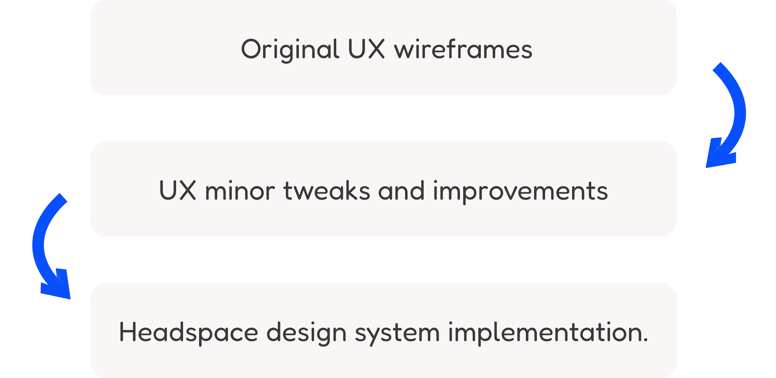
An imaginary UI design project showcasing how the ‘Clalit Health Services’ app would appear if it inherit the Headspace design system. The project aims to create a user-friendly interface to enhance the overall user experience and accessibility for a wider audience.

An imaginary UI design project showcasing how the ‘Clalit Health Services’ app would appear if it inherit the Headspace design system. The project aims to create a user-friendly interface to enhance the overall user experience and accessibility for a wider audience.

So why Headspace you asked?

So why Headspace you asked?

So why Headspace you asked?

A user-friendly and positive UI design is essential for healthcare digital products. It enhances confidence, encourages user engagement and monitoring, and reduces anxiety and stress associated with medical care, creating a supportive and empowering digital space for health management.

Process

Process

Process

Physical health is inseparable from emotional and mental health. In nurturing one, we fortify the others, creating a harmonious symphony of well-being.

Physical health is inseparable from emotional and mental health. In nurturing one, we fortify the others, creating a harmonious symphony of well-being.

Physical health is inseparable from emotional and mental health. In nurturing one, we fortify the others, creating a harmonious symphony of well-being.

Physical health is inseparable from emotional and mental health.
In nurturing one, we fortify the others, creating a harmonious symphony of well-being.

World Health Organization

World Health Organization

World Health Organization

World Health Organization

Physical health is inseparable from emotional and mental health. In nurturing one, we fortify the others, creating a harmonious symphony of well-being.

World Health Organization

Onboarding

Onboarding

Onboarding

Original Screen

1

2

1

Headspace UI implementation

1

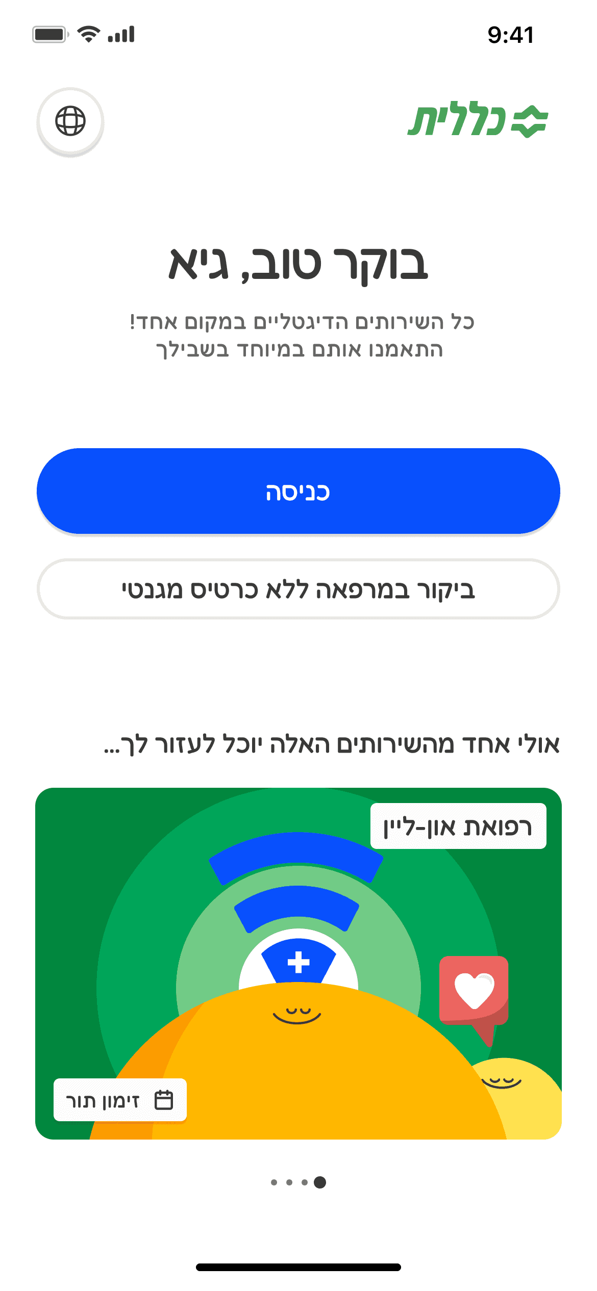
A secondary button with a clearer visual appearance.

A subtler, logo-like appearance.

2

Horizontal scrolling changed to carousal:

  • Users must log in to perform any action, so initially, the cards couldn't used as quick actions. appearance changes from 'call-to-action' to demonstration.


  • IIncorporate more uplifting content during the initial use of the app.

Headspace UI implementation

2

1

1

A secondary button with a clearer visual appearance.

2

Horizontal scrolling changed to carousal:

  • Users must log in to perform any action, so initially, the cards couldn't used as quick actions. appearance changes from 'call-to-action' to demonstration.


  • Incorporate more uplifting content during the initial use of the app.

Profile

Profile

Profile

Original Screen

3

Headspace UI implementation
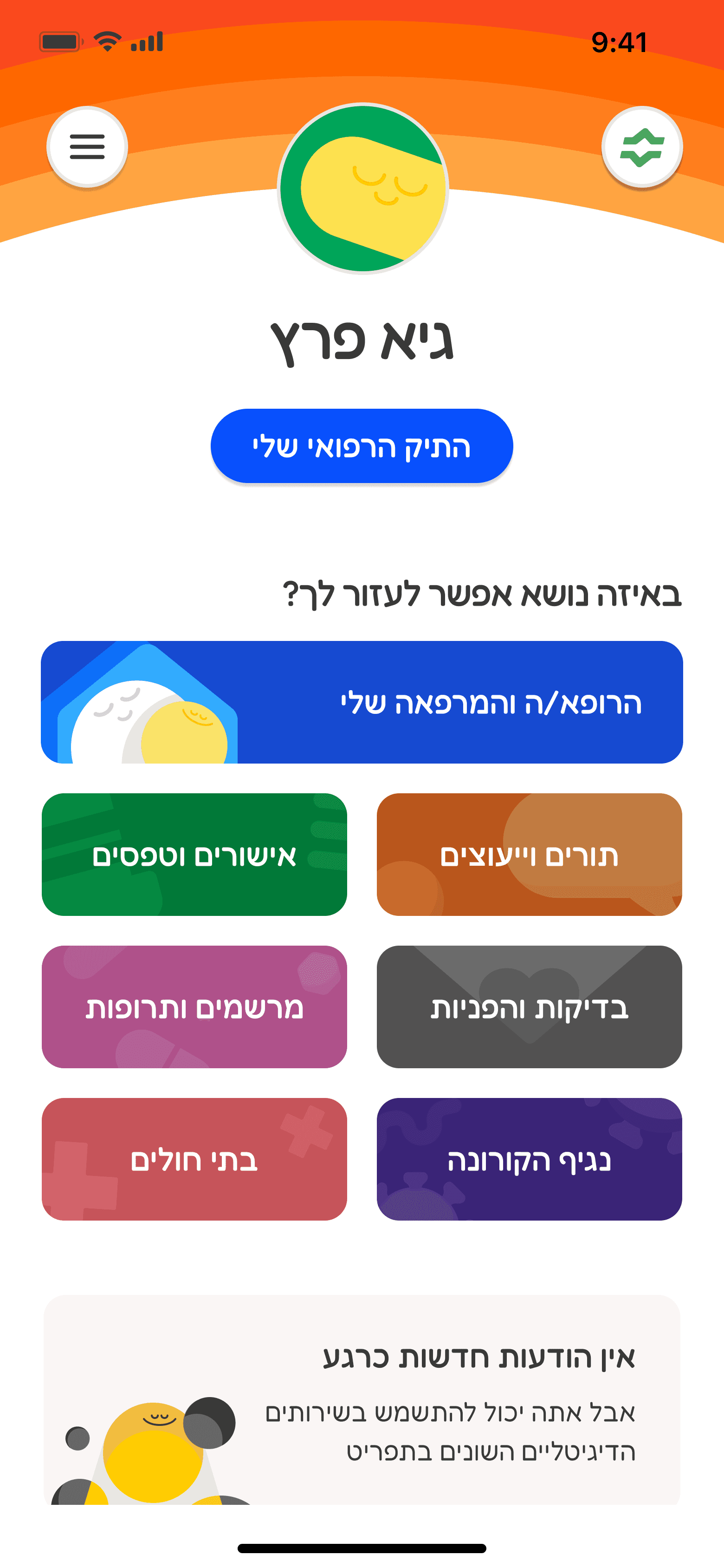
3

3

The homepage contains all main sections on one screen without horizontal scrolling.

My medical file

My medical file

My medical file

Original Screen

5

4

Headspace UI implementation

5

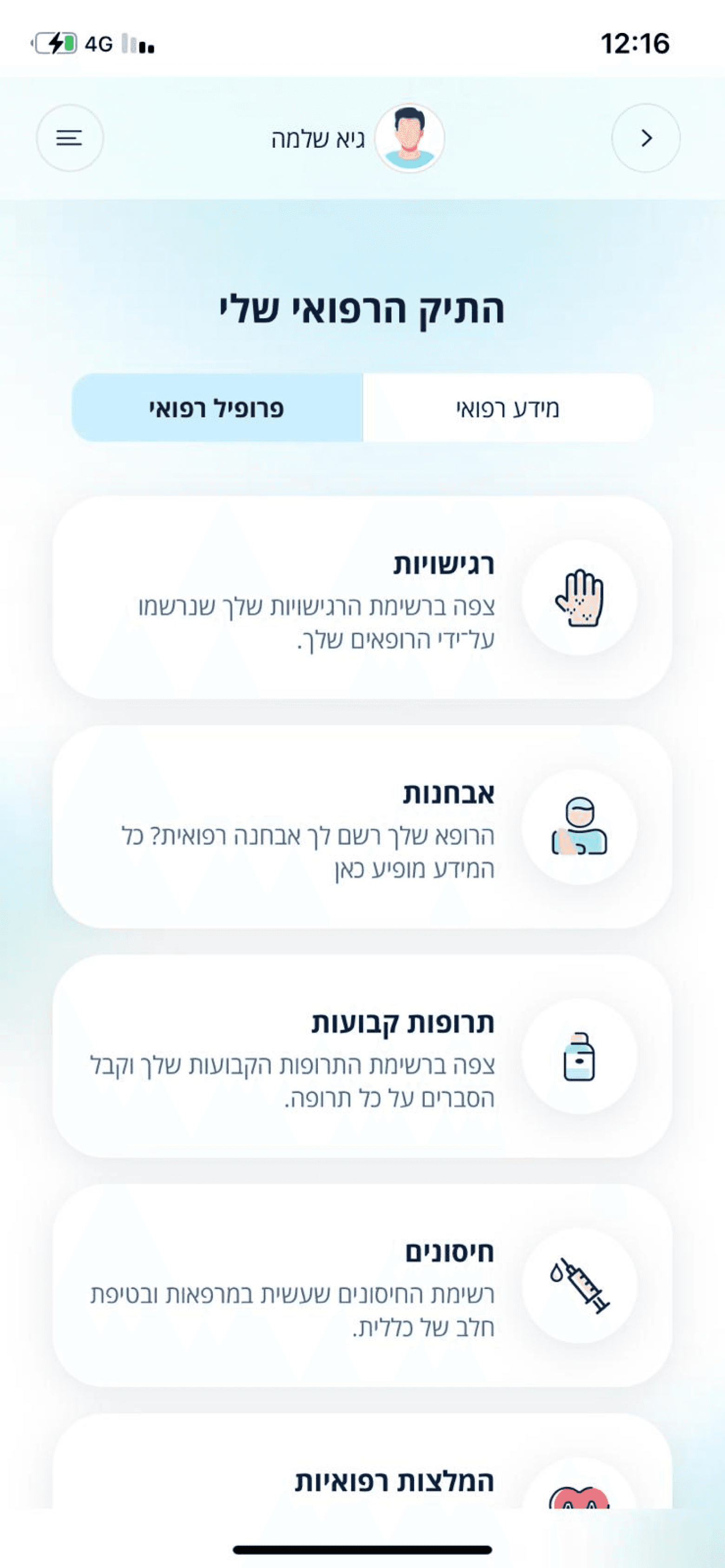
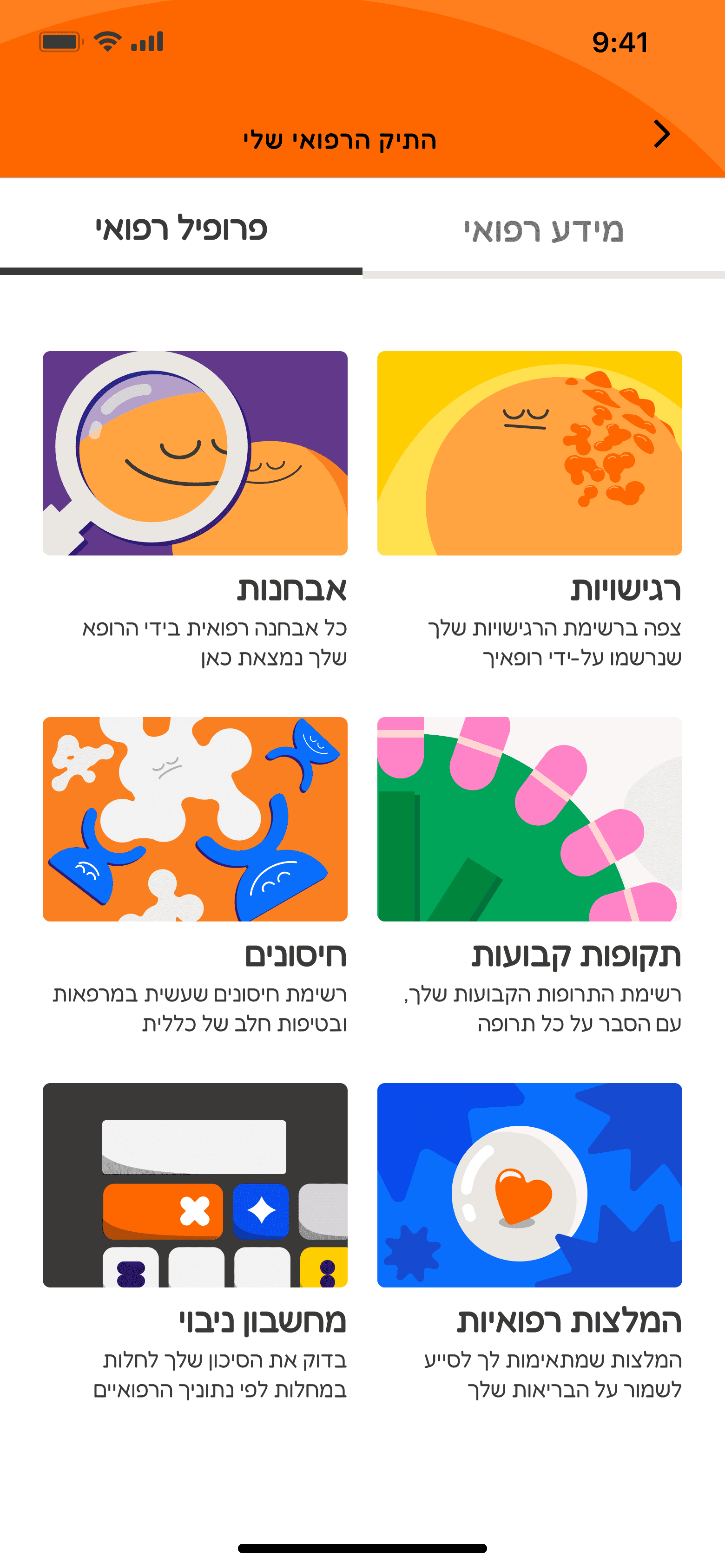
An attempt to make the medical file less formal and more positive by adding illustrations to each card.

4

Improving the heading for better orientation.

5

An attempt to make the medical file less formal and more positive by adding illustrations to each card.

4

Improving the heading for better orientation.

Headspace UI implementation

4

5

Your path to feeling better is just a click away with our healthcare solutions!

Your path to feeling better is just a click away with our healthcare solutions!

Your path to feeling better is just a click away with our healthcare solutions!

You are just a few steps

away from feeling better.

Test Results

Test Results

Test Results

Original Screen

7

6

7

6

7

6

Headspace UI implementation

7

Headspace UI implementation

7

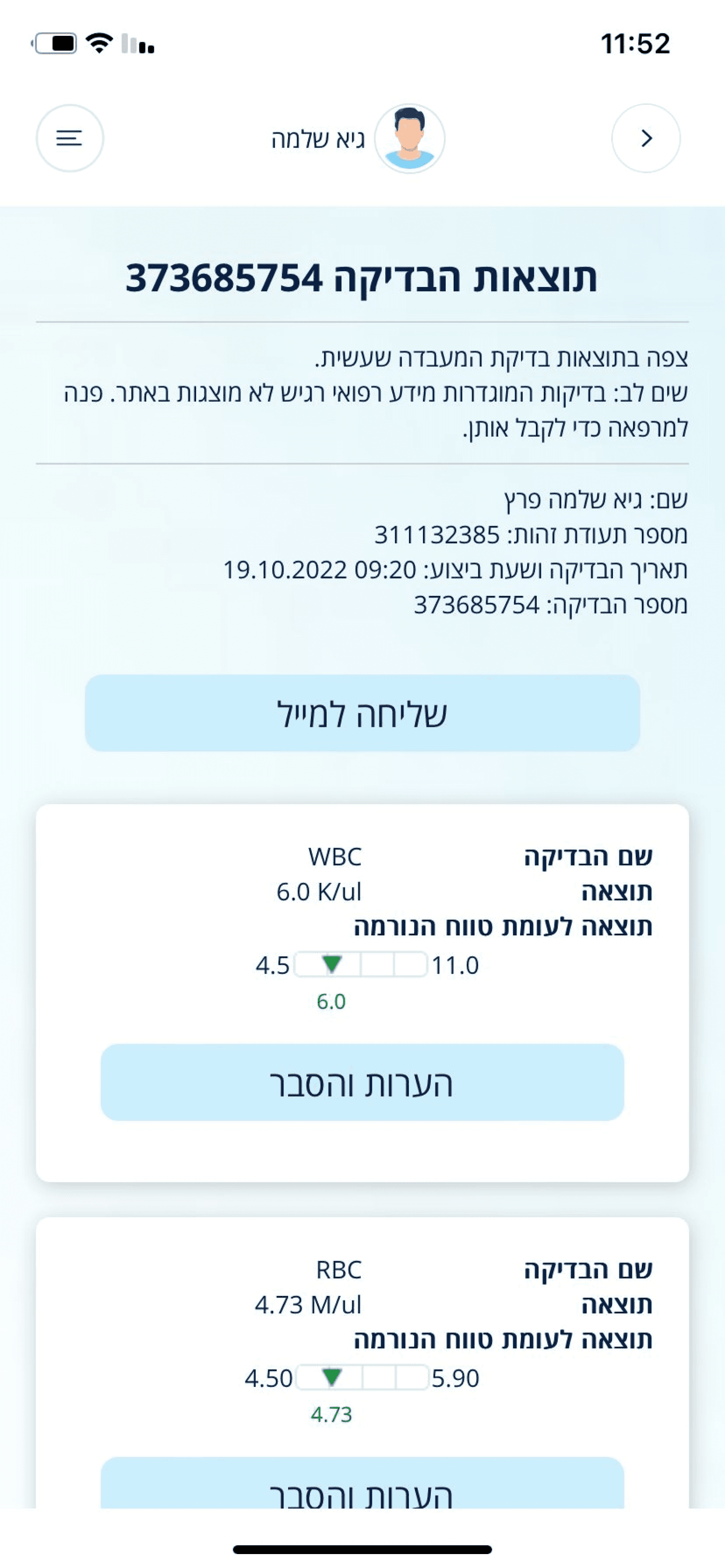
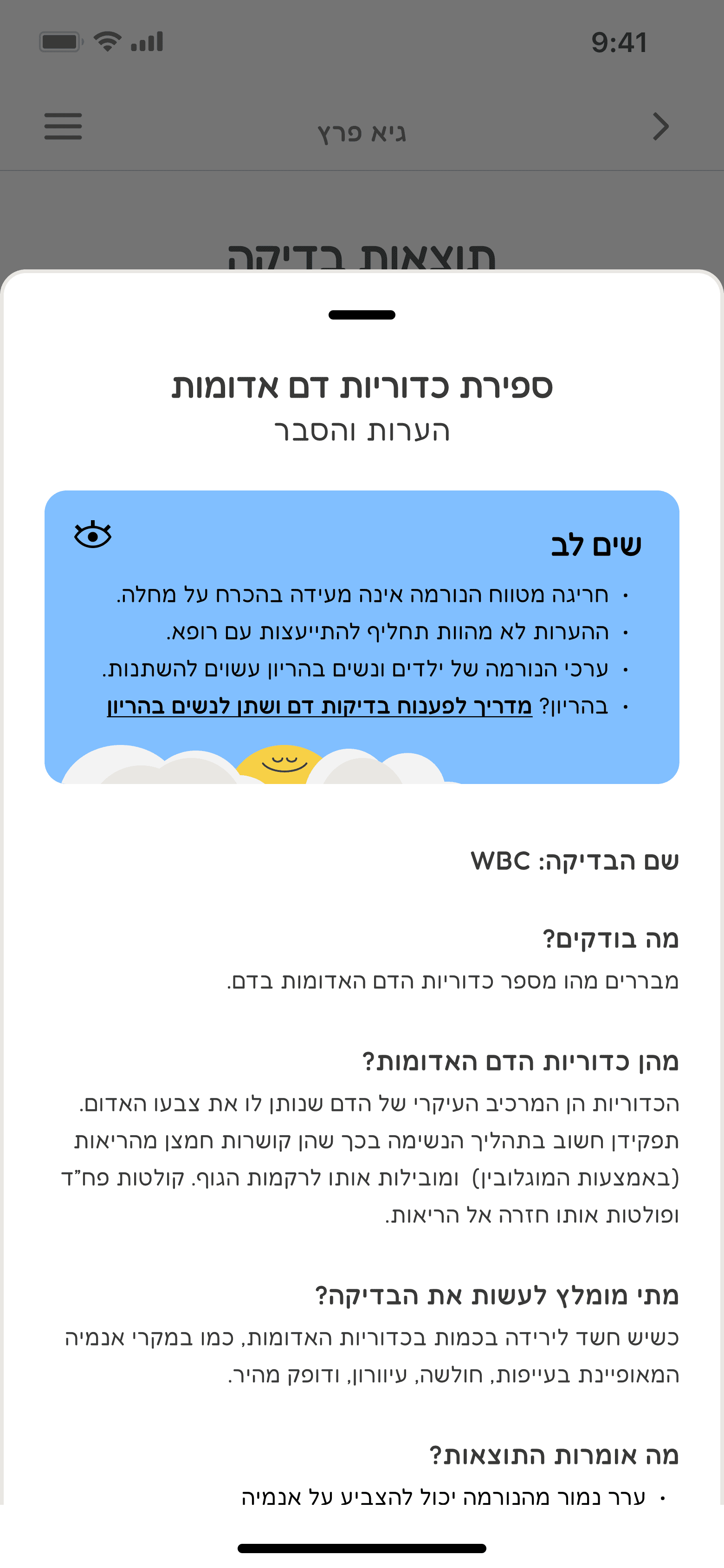
I suggest adding an option to minimize cards to improve the readability and create a cleaner appearance.


Information now appears in a bottom sheet layer rather than a progressive disclosure on each card, simplifying orientation and minimizing scrolling.

6

Adding an option to hide notification notes.

Categories

Headspace UI implementation

Original Screens

Categories

Categories

Categories

Original Screen

Headspace UI implementation

Vaccines

Vaccines

Vaccines

Original Screen

9

8

Headspace UI implementation

8

9

8

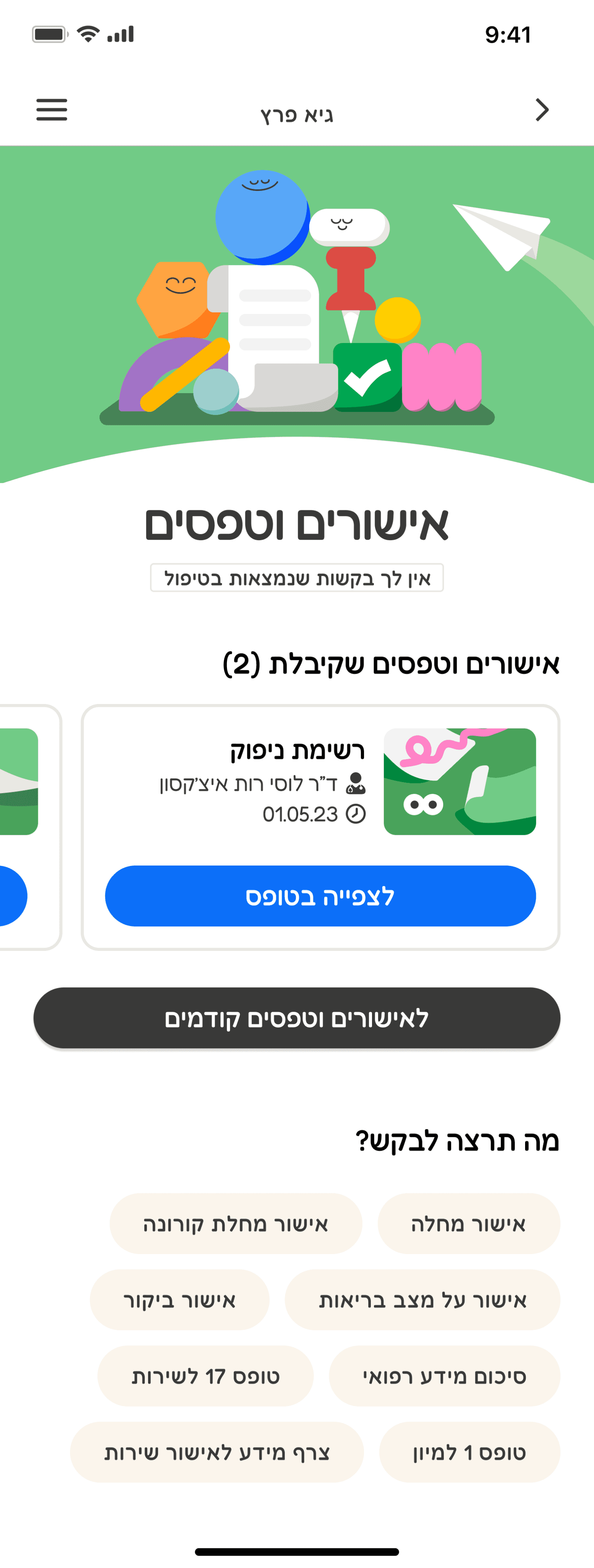
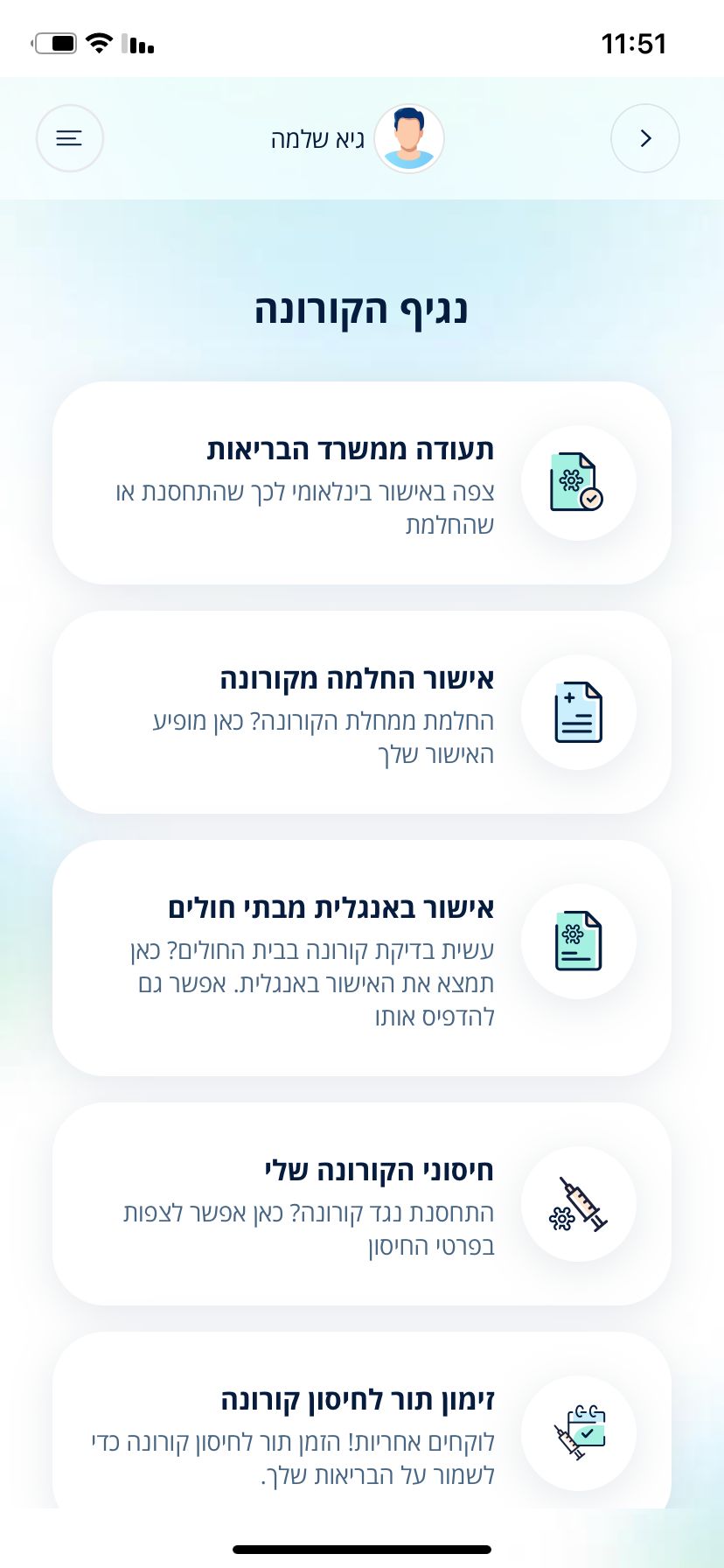
To decrease fractions, I added a tab system rather than a filter button.

9

Include an indicator to show if a vaccine has expired or needs administering. Add a CTA button from the card to make things simpler.

Thank you for scrolling till the end

Thank you for scrolling till the end

Thank you for scrolling till the end

Let's Talk!

Copyright Guy Peretz 2023

Let's Talk!

Copyright Guy Peretz 2023